PEAL – Branding, Graphic Design & Visualisation
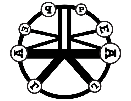
Malcolm Garrett, RDI – Creative Director at Applied Information Group (AIG) has been developing the PEAL branding and graphic design for the ‘monitor’ output – and though still in development we think its circularity and clean, minimal vector aesthetic and historical font are right on tip. There are a series of variations for each of the installation modes: idle (above); self play, guided play, performance and timepiece.
L: I’m pretty certain that the bells increase regularly in size clockwise – and if we’re going to use these graphic circles as placing for the ‘bell posts’ which actually represent the rope for a specific bell – and the same bell no matter what mode – then I wonder if the circles shouldn’t just increase regularly in size clockwise? I appreciate this might not look graphically so great? Also we might in certain modes switch the letters for Arabic numbers – the bells are numbered 1- treble (smallest bell) to 8 – tenor (largest bell)…”
M: I’ll revise. Randomness looks good, but isn’t strictly accurate I realise. Using numbers as well is no problem.
L: …and there’ll be some text to display too… though not on screen all the time… one example for ‘self play’ might well be:
“In the year 1742 the old Peal of Six Bells in the Parish Church of Leeds was augmented to Eight by Mr Harrison of Barrow in Lincolnshire and on June 30th in the same year was Rung on those Bells 5040 Grandsire Tripples in 3 hours and 8 minutes by the following persons:
1 Thomas Wormald
2 Joseph Heaton
3 Richard Grayson
4 William Forrest
5 William Robinson
6 William Smith
7 John Smith
8 Robert Hague Tenor
Conducted by Wm Smith
The first Peal ever Rung in Leeds.”
M: Thanks for sample text, I’ll work this into layouts.
L: Re colours… wood and stone with ultramarine/purple combo sounds good… but I do think each bell should be a different colour – or a different tint/hue of a strong but limited palette – remembering that we want to match them with the colours of the RGB LEDs in the bell posts… which can’t reproduce subtle differences that well…
M: Strong alternating colours might help too?
UK-based artist, designer and programmer Daniel Jones has agreed to help us build the ‘mode’ by ‘mode’ visualisation based on Malcolm’s design – initially conceived for display on a plasma screen but now planned for projection from overhead onto a circular screen on the floor in between the bell posts. It makes sense to us to programme this in Processing and build on some of the development work we started with MonoScape.
Lets start from the ground up… you and Nick need to chat to make sure you’ve got the basic architecture and communication protocols sorted between you so that you can start to code something from a solid base. Lets take an approach where you and Nick develop functionally working versions which you and I can then skin and refine?
I think some Processing research – looking into alternative libraries and renderers for importing and displaying SVG – would definitely be a good idea… and I need to show you where Nick and I have got to here with our own development. I do think the OCD (Obsessive Camera Direction) library would be a good solution for shifting viewpoints within the sketch – moving the camera/cutting to a different camera feed rather than actually rotating the graphic?… and again Nick and I have done some development work here to show.
